
The different types of charts used in Forex trading are used to plot the price movement of a currency pair over time. The x axis has time increments increasing left to right. The y axis has price increments increasing bottom to top. Charts are used to keep track of current prices and for research on the history of a pair’s price movement.
There are three types of charts used in Forex: the line chart, the bar chart, and the candlestick chart. For the sake of illustration and comparison, we will visualize each type of chart on EUR/USD during the period of June 2010 through July 2010.
Line Chart
The most basic of the three charts is the line chart because it represents only the closing prices over a set period of time. The line is formed by connecting the closing prices over the time frame. Some may like for the line chart for its simplicity. However, it is lacking in showing the visual information of the trading range, such as the high, low, and opening.
Example of Line Chart on EURUSD Daily:
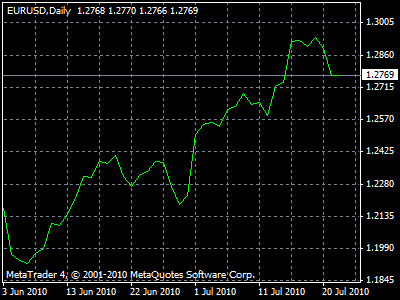
As you can see, line charts show closing price movement only.
Bar Charts
A plot consisting of a series of vertical lines, each representing the price range during a specified time period, each vertical line have a small horizontal line connecting on its left, indicating the opening price for that time period, and a small horizontal line connecting on its right, indicating the closing price for that time period.
Example of Bar Chart on EURUSD Daily:
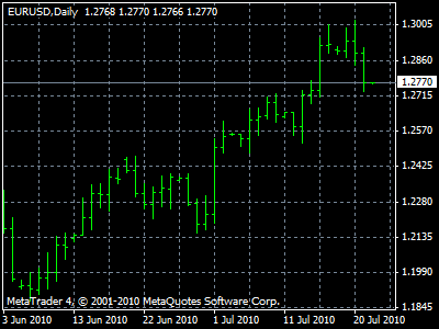
Let us look at an individual bar in more detail:

As one can see, the single bar of a Bar Chart shows the entire price movement: the opening price (horizontal bar on the left side), close (horizontal bar on the right side), highs (the extension from the open bar), and low (the extension from the closing bar price).
Japanese Candlestick Charts
A plot consisting of a series of thick vertical lines (“candles”), colored to indicate a lower or higher close compared to the previous candle, representing the price range, high price, and low price for the time frame it represents.
Example of Candlestick Chart on EURUSD Daily:
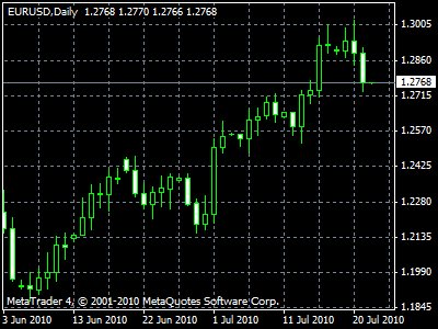
Both the Bar chart and the Candlestick chart give the same info; however, the Candlestick is easier to read.
Candlestick Chart shows price movement, closing prices, opening prices, & highs and lows for a given time frame. The top and bottom of the body reveal the open and close, the wick after the top shows the high, and wick below the bottom shows the low. We will be showing more examples of candlesticks in the chart patterns under Japanese candlesticks.
Time frame
The standard unit of time measured on a chart. In MT4 the chart time frames are M1 (1 minute), M5 (5 minute), M15 (15 minute), M30 (30 minute), H1 (Hourly), H4 (4 Hour), D1 (Daily), W1 (Weekly), and MN (Monthly). The 5-minute candlestick chart means each candlestick shows the price range that occurred during 5 minutes of trading, at the time listed on the x axis of the chart.
